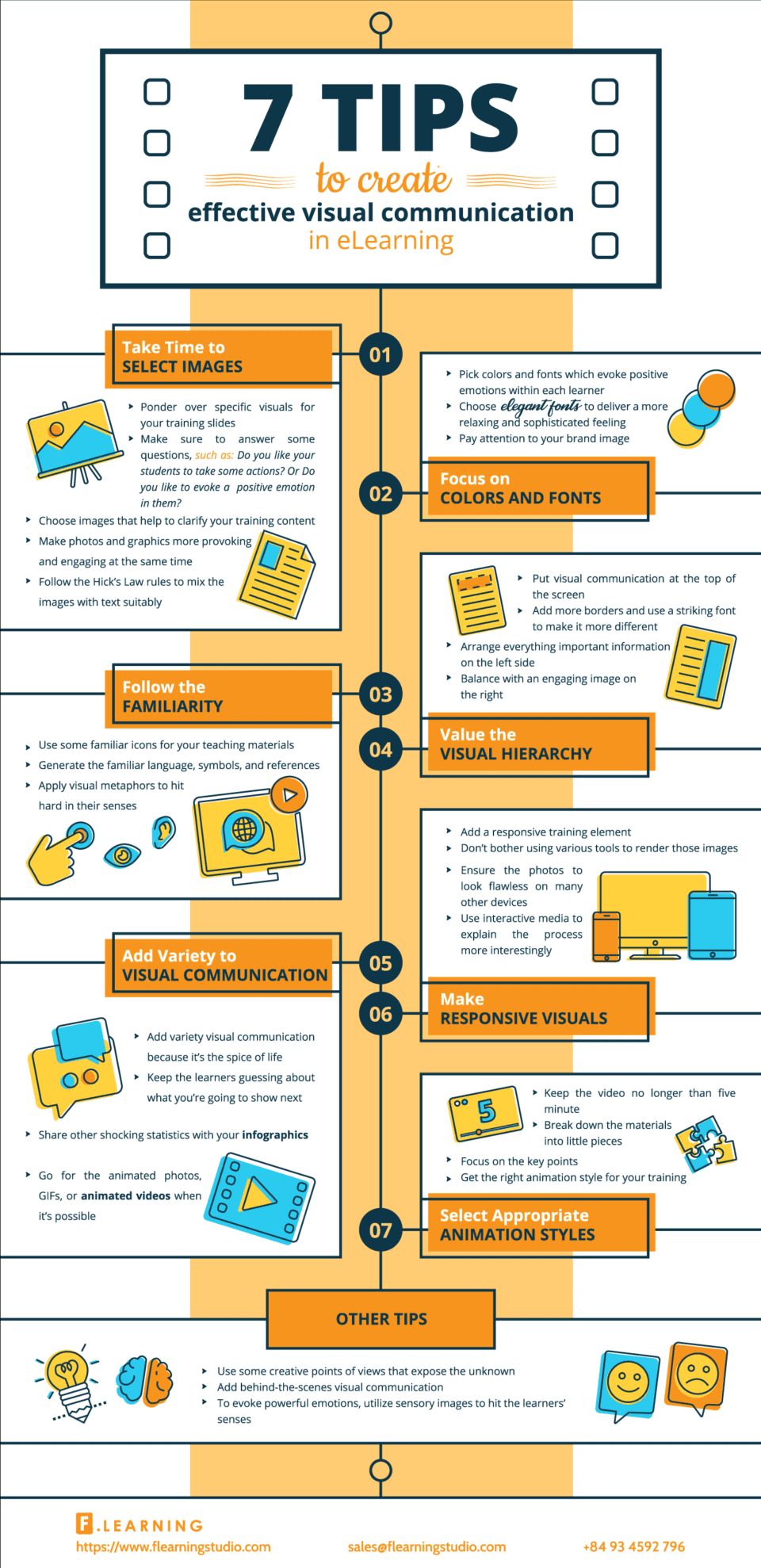
7 steps to create effective visual communication - Infographics
From the choice of the font to the responsive design, the visual elements are fundamental for the proper functioning of an eLearning platform. Here are seven tips for creating excellent visual communication.
In an era in which we are constantly "bombarded" by images, visual communication also plays a fundamental role in eLearning. The design of the platform is a useful element not only for aesthetic purposes but also for practical ones. The appearance of the site, for example, it allows students to understand how to move between lessons and sections. From the images, passing through the icons and arriving at the font, effective visual communication must be one of the main objectives for those who plan online courses. What are the indispensable steps to take in the graphic design phase?
1. Choose your images carefully
Images are an essential element even if they are often chosen in a rather absent-minded way. In fact, they serve to arouse certain emotions in the people who are watching them and, in eLearning, also to better explain a concept or contextualize a specific content.
2. Pay attention to the font and colors
As well as the images, the style and color of the text also serve to arouse different sensations in the students, from the most positive to the most relaxing ones. In addition, color can help make text more readable and divide content in a practical way.
3. Use "familiar" visual elements
It is preferable to use icons or symbols that are familiar to students, in order to make navigation within the platform easier.
4. Remember the importance of the visual hierarchy
A site or platform cannot be designed without implementing the principles of the so-called "visual hierarchy", that is, the way of organizing content in such a way as to communicate a certain message to the user. A few examples? It is preferable to insert the most important information on the left and balance the page by adding an image on the right.
5. Diversify the content of the platform
Although it is necessary to prefer simplicity, it is also true that an eLearning platform must be able to attract the attention of students. To obtain this result, without confusing users, it can be useful to insert infographics or gifs, to "move" the pages and make them more attractive.
6. Use responsive design
As always, in order to meet the needs of the students, it is essential that the platform is created through the so-called " responsive design". This term means the possibility of being able to use the course on all electronic devices, from the computer to the smartphone, without this interfering with the usability of the site.
7. Use interactive elements
Video, gif and other types of animated elements are very useful in online courses. Videos must be processed consciously. As we have already explained in previous articles, it will be necessary to carefully choose not only the content, but also the length of the videos in order to take full advantage of the benefits of these visual elements.
Infografica tratta da eLearningInfographics
